Save Money, Reduce Hassle, and Get More
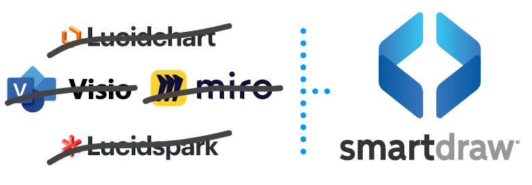
Unleash your team's productivity by combining enterprise-class diagramming, whiteboarding, and data while saving 10x over Visio and Lucidchart!
Unleash your team's productivity by combining enterprise-class diagramming, whiteboarding, and data while saving 10x over Visio and Lucidchart!