The data you collect in your business is only as valuable as its analysis and presentation. Without the latter, problems cannot be solved. Opportunities cannot be capitalized. Decisions cannot be made. Data presented to audiences can be a mine field. So, as the leader, be mindful of how you present your data and findings for your audience (or team) with the use of charts and visuals.
The key is to present the data in palpable ways. And nothing accomplishes this more effectively than the use of visuals. Properly constructed charts, and other visuals, certainly provide insight. But you already know this. However, what if I told you that presenting data through visuals is only the beginning?
Look, pouring over data in a spreadsheet is an arduous task. One simply cannot detect through the data alone whether or not the business is improving, souring or remains stagnant. But through the use of visuals, you are now able to determine trends, opportunities and make a slew of strategic planning and other business decisions.
However, simply presenting various charts, graphs and other diagrams to illustrate your data may also gloss over key learnings that may be important to you and your business. What I mean is — don't throw the entire kitchen at them (or chart). Reveal it sequentially so that the entire message is understood.
Let's look at this as if you are to give a presentation later this week. Essentially, you are presenting to the entire company how the business performed, and in particular, the sales results for the end of the fiscal year.
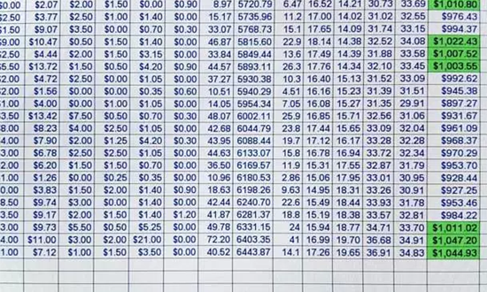
You could simply project your spreadsheet of the numbers onto the screen and verbally disclose your learnings to the audience. But a spreadsheet of all the sales transactions (similar to the one below) would be far too overwhelming and detailed. Looking at the numbers, one cannot determine if sales are up? Flat? Sideways? It's far too granular.
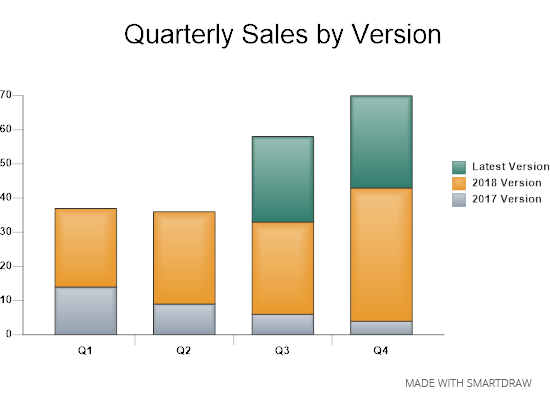
So if we know the audience finds it difficult to make the connection from what you say and what you are showing, you could throw your data into a chart (like the one below) and present it to them. The chart is now able to illustrate the sales numbers at a higher level to essentially show the accumulation of sales growing over time this past fiscal year.
However, charts presented all at once don't fully realize the potential impact of your message with your audience. Why? Because the audience may not see or comprehend some key data points that you learned from your analysis and find important for them to understand.
In this example, you want the audience to not only see the overall sales numbers over time for this past fiscal year, but to also understand how the various versions of the product performed. To do this with your chart, reveal the data sequentially. Now your presentation presents all of the data in a step-by-step format easily digested, and thoroughly explained by your audience.
For example, your presentation may go a little something like this:
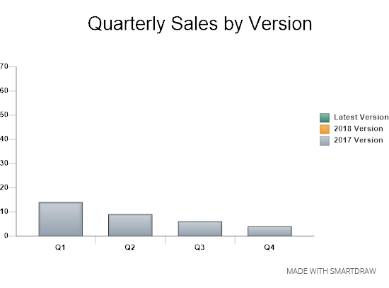
...and now to show you how our sales performed for the past year. First, coming into the year we supported two product versions: the 2017 and 2018 versions. As you can see from this first data set within our chart, the sales for the 2017 version waned as the year progressed."
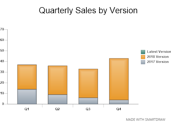
Our 2018 version at first glance shows flat growth. But if you look closely at our chart, you will see a large uptick in sales in Q4."
And of course, we debuted our latest version earlier this year. However, as good as the latest version sold right out of the gate, the sales of our 2018 version outperformed it in Q4. And by a staggering margin."
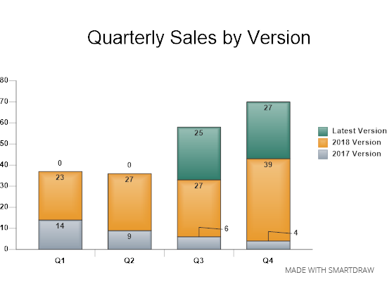
Because of these Q4 numbers, we are proceeding with further product and customer analysis to learn more about the customer satisfaction within these versions. In particular the 2018 version for further opportunities."
As you can see, using charts and other visuals as well as sequentially revealing the data creates a more compelling presentation for your audience. And the audience now understands the data originated from your spreadsheets. A presentation home run!