A pie chart is a circular chart divided into wedge-like sectors, illustrating proportion. Each wedge represents a proportionate part of the whole, and the total value of the pie is always 100 percent.
Pie charts can make the size of portions easy to understand at a glance. They're widely used in business presentations and education to show the proportions among a large variety of categories including expenses, segments of a population, or answers to a survey.
Back to top
Some critics of pie charts point out that the portions are hard to compare across other pie charts and if a pie chart has too many wedges, even wedges in a single pie chart are hard to visually contrast against each other compared to the height of bars in a bar graph for example.
Bar charts are easier to read when you're comparing categories or looking at change over time. The only thing bar charts lack is the whole-part relationship that makes pie charts unique. Pie charts imply that if one wedge gets bigger, the other has to be smaller. This would not be true of two bars on a bar chart.
Back to top
Don't use more than 5 slices in any pie chart otherwise it becomes too hard to read.
Don't use a pie chart if the values of the wedges are close to each other and it's important to see the differences. For example, 32%, 33% and 35% will look pretty even at a glance when illustrated on a pie chart. Using a bar chart will make the differences more obvious.
Don't use a pie chart if what you're comparing are not parts of a whole. For example, it makes sense to use a pie chart to compare the profitability of different divisions inside a larger enterprise. However, it doesn't make sense to compare different companies using a pie chart since there's a much larger number of companies and they don't belong to any meaningful whole.
Categories on the pie chart must be mutually exclusive and not overlapping.
Back to top
Pie charts have been around since the 1800s when they were used to illustrate statistics and maps.
Florence Nightingale popularized the pie chart as a form of persuasion using statistics by calling attention to the mortality rates caused by poor sanitary conditions during the Crimean war.
Back to top
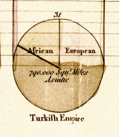
Image from William Playfair's "Statistical Breviary"