VS.Graph()
You can create a graph by adding an instance of a VS.Graph() to a
VS.Shape() object:
myGraph=myShape.AddGraph(GraphType);
A graph fills a shape. If you make a shape into a graph, that same shape can't be a table, a timeline, gauge, or a Gantt chart. The parent
shape can support a text label that appears under the graph.
The shape is sized to a minimum size suitable for the graph or if larger, the graph is
scaled up to fit the shape. The shape adopts the aspect ratio of the graph.
The axes and legend are built automatically.
Graph Data
Graphs use a VS.DataTable() object as their source for data. All graphs except for pie charts are assigned a whole VS.DataTable(). A pie chart uses just one data row.
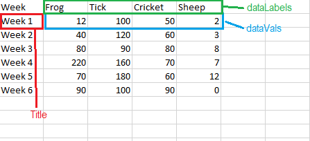
The first column of the DataTable contains the X values.
Each additional column contains a Y data set. The first row of the table give the title to each Y data set.
The datatable used by the graph is set with myGraph.SetDataTableID(ID) where the ID is the ID of the VS.DataTable data table.
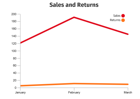
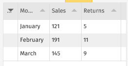
Here is the data table for the above graph:
When you're generating a pie chart, VisualScript uses the first data row for the values of each slice. You can select another row by using myGraph.SetDataTableRow(ID) to set a row with the ID value of other than 1.
There are currently two Graph_Types. More will be added in the coming months:
VS.Graph_Types =
{
LineChart: "LineChart",
AreaChart: "AreaChart",
PieChart: "PieChart",
DonutChart: "Donut",
BarChart: "BarChart",
BarChartStacked: "BarChartStacked",
BarChartHorizontal: "BarChartHorizontal",
BarChartStackedHorizontal: "BarChartStackedHorizontal",
};
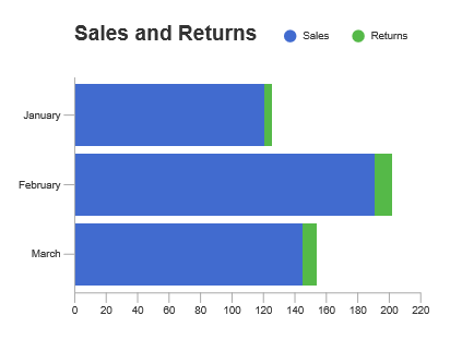
Take the data from above and let's look at it visualized in all the different graph types.
Here's the LineChart.
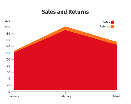
Here's the same data as an AreaChart.
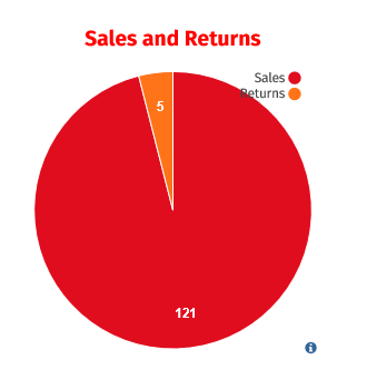
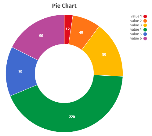
Here it is as a PieChart using row 1.
A Donut chart is a pie with a hole in the middle.
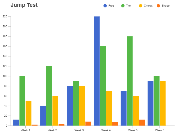
The data as BarChart.
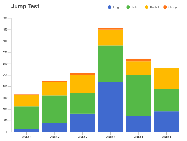
The data using BarChartStacked.
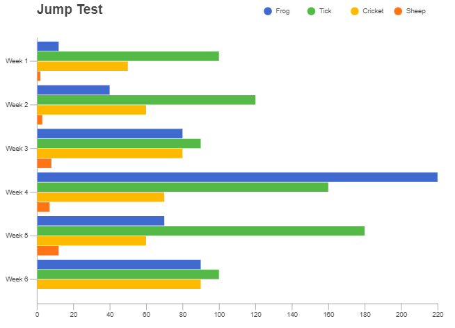
The same data with BarChartHorizontal.
And finally, here's the data as BarChartStackedHorizonal.
These methods return the Graph object and can be chained together:
- SetDataTable() - Assign a VS.DataTable() object to the graph.
- SetDataTableRow() - Assign the row of data in the VS.DataTable() to use for the values of each slice in a PieChart. Other graph types ignore this setting and use the whole table.
- SetProperties() - Set values for an array of properties for the gauge as specified by its GraphType.
Example
myGraph=myGraph.SetDataTable(1)
Syntax
myGraph=myGraph.SetDataTable(TableID);
Usage
The data for a graph is contained in a VS.DataTable() object. The first column of the DataTable contains the X values. Each additional column contains a Y data set. The first row of the table give the title to each Y data set.
A DataTable() is created with a call to myDocument.AddDataTable(ID,Title,CSVString). The CSVString defines the data and is optional. Columns and rows of values can also be added using the VS.Document() methods.
Example
myGraph=myGraph.SetDataTableRow(3)
Syntax
myGraph=myGraph.SetDataTableRow(ID);
Usage
The data for a graph is contained in a VS.DataTable() object. The first column of the DataTable contains the X values. Each additional column contains a Y data set.
The first row of the table gives the title to each Y data set. For a PieChart, the values of each slice is taken from one of the data rows.
By default, the values will be taken from the first row that is not the title with ID 1. This method overrides this default.
A DataTable() is created with a call to myDocument.AddDataTable(ID,Title,CSVString). The CSVString defines the data and is optional. Columns and rows of values can also be added using the VS.Document() methods.
This method has no effect for other charts than a PieChart.
Example
myGraph=myGraph.SetProperties([{Name:VS.LineChart_Properties.LegendPos,Value:"inside"},{Name:VS.LineChart_Properties.Title,Value:"Sales and Returns"},{Name:VS.LineChart_Properties.TitlePos,Value:"top"}]);
Syntax
myGraph=myGraph.SetProperties(valuearray);
Usage
Each type of graph has a defined set of properties, with defaults for all of them. The SetProperties method passes an array of
overriding values for one or more of the named properties.
LineCharts, AreaCharts and BarCharts
- graphAreaWidth: width of the core graph area (minus axis, legend and title)
- graphAreaHeight: height of the core graph area (minus axis, legend and title)
-
legendPos: data set legend positioning
- "none": do not display
- "inside": display within graph area (vertical layout)
- "right": display to right of graph area (vertical layout)
- "top": display above graph area (horizontal layout)
- "topleft": display above graph area, using only left half of graph area
- "topright": display above graph area, using only right half of graph area
- "bottom": display below graph area (horizontal layout)
- "bottomleft": display below graph area, using only left half of graph area
- "bottomright": display below graph area, using only right half of graph area
-
legendShape: legend color shape
- "round": draw the legend color as circle
- "square" draw the legend color as square
- unitLabel: y axis units label that is displayed at the top of the y axis
- tickLen: axis tick lengths
- tickWidth: line thickness of the ticks
- graphLineWidth: line thickness of the graph data lines
- yTickCount: # of ticks on the y axis
- yMinZero: if true, sets the min value of the yAxis to 0, otherwise, min value is computed from the data
- yRuleLines: if true, displays ruling lines behind the graph, aligned with the y axis ticks
- yAxisHide: if true, hides the main (vertical) part of the y axis (ticks and tick labels will still be shown unless yTickCount = 0)
- xAxisStep: the step count for the x axis labels (and ticks). Defaults to 1, meaning no labels are skipped. Note: the step will be increased if there is not enough room for the x axis labels.
- xLabelMaxLen: if set (or non-zero), will truncate x axis labels to the given max length (and add tooltips to the labels with the entire original text).
-
xLabelBehavior: defines optional layout for the x axis labels:
- "vertical": orients the labels vertically
- "wrap": wraps the labels to the bar (group) width (min wrap width of 40 pixels)
- "none": (default) leaves labels as single horizontal text line (current behavior)
-
yFormatter: D3-based format string for the yAxis labels (see
https://github.com/d3/d3-format Default is "s")
- dataSetColors: comma-separated list of colors that define the data set colors
- labelFontSize: font size of the axis, unit and legend text
- title: title text
-
titlePos: title position
- "none": no title
- "top": display above graph area
- "topleft": display above graph area, on left
- "topright": display above graph area, on right
- "bottom": display below graph area
- "bottomleft": display below graph area, on left
- "bottomright": display below graph area, on right
- titleColor: title text color (set via SetTextColor)
- titleFontSize: title font size
- dataVals: array of data values to graph. Each value in the array is an array of values for each data set at a given x position in the graph.
- dataSetLabels: array of data set labels. Must match the count of data sets defined in dataVals.
- xAxisLabels: array of x axis labels, corresponding to each entry in the dataVals array. Must match the count of data records in the dataVals list.
-
barGroupType: how to display multiple data set groups (barcharts only)
- "group": grouped bars (default)
- "stack": stacked bars
-
barOrient: bar orientation (barcharts only)
- "vert": vertical bars (default)
- "horiz": horizontal bars (note: x and y axes are swapped in this case)
The following properties are set by setting properties on the parent shape of the graph:
- strokeColor: axis line color (set via SetLineColor)
- strokeWidth: axis width (set via SetLineThickness)
- textColor: text color of the axis and legend and title labels (set via SetTextColor)
PieCharts
- chartRadius: radius of the core pie graph area (minus labels, legend and title)
- innerRadius: inner radius of the pie chart (a non-zero value creates a donut-type pie chart)
-
legendPos: data set legend positioning
- "none": do not display
- "right": display to right of graph area (vertical layout)
- "top": display above graph area (horizontal layout)
- "topleft": display above graph area, using only left half of graph area
- "topright": display above graph area, using only right half of graph area
- "bottom": display below graph area (horizontal layout)
- "bottomleft": display below graph area, using only left half of graph area
- "bottomright": display below graph area, using only right half of graph area
-
legendShape: legend color shape
- "round": draw the legend color as circle
- "square" draw the legend color as square
- displayDivider: Boolean. If true, display a divider between pie wedges.
- dataSetColors: comma-separated list of colors that define the data set colors
- labelFontSize: font size of the axis, unit and legend text
- labelColor: color of data labels when displayed outside of chart area as callouts (defaults to textColor)
- altLabelColor: color of data labels when displayed inside of chart area (defaults to labelColor)
-
labelPos: location of data labels
- "none": do not display data labels
- "inside": display data labels inside
- "outside": display data labels outside with callouts
- "mixed": display data labels inside if they fit, otherwise display outside with callouts
-
labelFormat: defines how the data labels are displayed
- "value": display data as values (default)
- "percent": display data as a percentage of the whole data set
- showDataLabels: Boolean. If true, prepend data title to the data.
- labelLineLength: length of data callout lines when displayed as outside.
- title: title text
-
titlePos: title position
- "none": no title
- "top": display above graph area
- "topleft": display above graph area, on left
- "topright": display above graph area, on right
- "bottom": display below graph area
- "bottomleft": display below graph area, on left
- "bottomright": display below graph area, on right
- titleColor: title text color (defaults to textColor)
- titleFontSize: title font size