VS.Gauge()
You can create a gauge by adding an instance of a VS.Gauge() to a VS.Shape() object:
myGauge=myShape.AddGauge(GaugeType);
A gauge fills a shape. If a shape becomes a gauge, it can't also contain a table, a timeline, nor a Gantt chart.
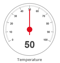
The parent shape can support a text label that appears under the gauge.
The shape is sized to a minimum size suitable for the gauge or if larger, the
gauge is scaled up to fit the shape. The shape adopts the aspect ratio of the gauge.
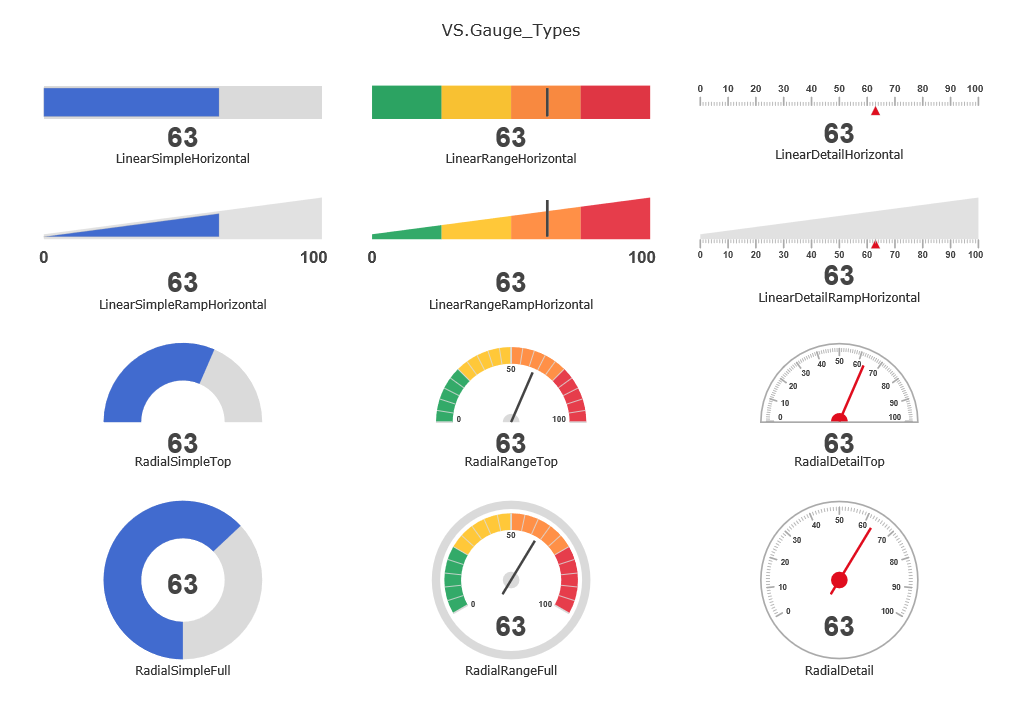
There are the following types of gauges:
VS.Gauge_Types =
                    {
                    RadialDetail: "RadialGauge",
                    RadialDetailTop: "RadialGaugeTop",
                    RadialSimpleTop: "RadialSimpleTop",
                    RadialSimpleLeft: "RadialSimpleLeft",
                    RadialSimpleBottom: "RadialSimpleBottom",
                    RadialSimpleRight: "RadialSimpleRight",
                    RadialSimpleFull: "RadialSimpleFull",
                    RadialRangeTop: "RadialRangeTop",
                    RadialRangeLeft: "RadialRangeLeft",
                    RadialRangeBottom: "RadialRangeBottom",
                    RadialRangeRight: "RadialRangeRight",
                    RadialRangeFull: "RadialRangeFull",
                    LinearDetailHorizontal: "LinearGauge",
                    LinearDetailRampHorizontal: "LinearDetailRampHorizontal",
                    LinearSimpleHorizontal: "LinearSimpleHorizontal",
                    LinearSimpleRampHorizontal: "LinearSimpleRampHorizontal",
                    LinearRangeHorizontal: "LinearRangeHorizontal",
                    LinearRangeRampHorizontal: "LinearRangeRampHorizontal",
                    LinearDetailVertical: "LinearGaugeVertical",
                    LinearDetailRampVertical: "LinearDetailRampVertical",
                    LinearSimpleVertical: "LinearSimpleVertical",
                    LinearSimpleRampVertical: "LinearSimpleRampVertical",
                    LinearRangeVertical: "LinearRangeVertical",
                    LinearRangeRampVertical: "LinearRangeRampVertical",
                    };
When creating a gauge, choosing the type will create a gauge with a set of default settings. Depending on the type selected, your gauge will look like one of the following:
Gauges inherit their fill color, line color, text color and line thickness
from the parent shape. If you've selected shape properties different than the gauge defaults, your gauge will look different.
You can also override the default properties using the gauge methods specified below.
These methods return the Gauge object and can be chained together:
- SetProperties() - Set values for an array of properties for the gauge as specified by its GaugeType.
-
SetShowDataTable() - Adds a Shape Data table to the gauge to provide an interface for user input.
This applies only to SmartDraw, not VisualScript.
Example
myGauge=myGauge.SetProperties([{Name:VS.RadialGauge_Properties.Min,Value:0},{Name:VS.RadialGauge_Properties.Max,Value:200},{Name:VS.RadialGauge_Properties.Val,Value:35}]);
Syntax
myGauge=myGauge.SetProperties(valuearray);
Usage
A gauge has a defined set of properties, with defaults for all of them.
The SetProperties method passes an array of overriding values for one or more of the named properties.
There are two classes of gauge: Radial and Linear.
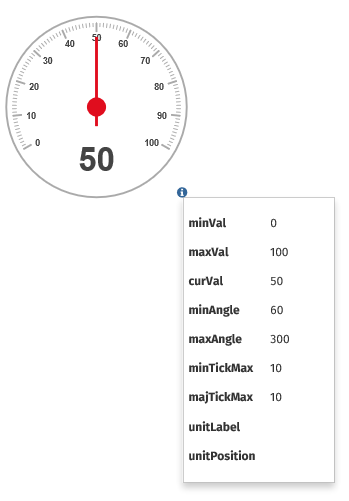
Radial Gauge Properties
- Min: sets the gauge range minimum data value
- Max: sets the gauge range maximum data value
- Val: sets the gauge current data value
- MinAngle: sets the start angle of the gauge range (0 degrees is at bottom)
- MaxAngle: sets the end angle of the gauge range (360 degrees is at bottom)
- MinTickMax: sets the maximum minor tick count
- MajTickMax: sets the maximum major tick count
- MinTickLen: sets the minor tick length
- MajTickLen: sets the major tick length
- MinTickColor: sets the minor tick color (defaults to the shape's LineColor)
- GetmajTickColor: sets the major tick color (defaults to the shape's LineColor)
- UnitLabel: sets the units label that is appended to the units display
- NoUnits: flag to turn off units display
- CenterColor: sets the color of the center pivot
- CenterRadius: sets the size of the center pivot
- IndicatorColor: sets the color of the indicator (defaults to the shape's LineColor)
-
PartialArcType: if set, specifies display of gauge as a partial arc. This can be one of:
- left: specifies a half circle on the left
- top: specifies a half circle on the top
- right: specifies a half circle on the right
- bottom: specifies a half circle on the bottom
- ltop: specifies a quarter circle on the top left
- rtop: specifies a quarter circle on the top right
- lbottom: specifies a quarter circle on the bottom left
- rbottom: specifies a quarter circle on the bottom right
- HollowCenter: flag to turn center pivot area into hollow area
-
RangeIndicators: a list of colored indicator ranges. Each range is defined by start%,end%,color.
Multiple ranges are separated by a semi-colon. e.g. 29
- FilledRange: if true, draws a filled arc as the value range
-
TickLabelFreq: if set, describes how ticks are drawn:
- all (or blank): draw all tick labels
- none: draw no tick labels
- startend: only draw first and last tick labels
- startendcenter: draw first and last tick labels, and if there is a center tick, draw center tick label
- LabelFontSize: font size of the tick label
- UnitFontSize: font size of the units label
-
UnitPosition: This can override the default position for the text showing the label. This can be:
- bottom: place the text under the gauge
- right: place the text to the right of the gauge
- top: place the text above the gauge
- left: place the text at the left of the gauge
- radius: sets the size of the gauge radius
Keep in mind that setting the parent shape's FillColor, LineColor, LineThickness and TextColor will also set these properties for the gauge.
Let's walk through some examples of what setting different properties looks like.
Examples of Radial Gauges
The default values for a RadialDetail gauge type will produce the following:
var myGauge=myShape.AddGauge("RadialGauge");
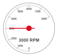
Here's an example where we modified the min/max angle of the radial gauge and added a unitLabel:
myGauge.SetProperties([
{Name:VS.RadialGauge_Properties.Val,Value:3000},
{Name:VS.RadialGauge_Properties.Max,Value:8000},
{Name:VS.RadialGauge_Properties.MinAngle,Value:0},
{Name:VS.RadialGauge_Properties.MaxAngle,Value:240},
{Name:VS.RadialGauge_Properties.UnitFontSize,Value:16},
{Name:VS.RadialGauge_Properties.UnitLabel,Value:" RPM"},
]);
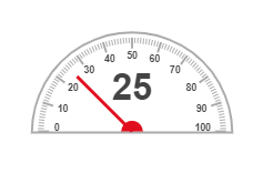
Here's an example of a partial arc type:
myGauge.SetProperties([
{Name:VS.RadialGauge_Properties.Val,Value:25},
{Name:VS.RadialGauge_Properties.PartialArcType,Value:"top"},
]);
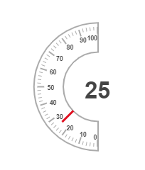
You can make any radial gauge hollow just set HollowCenter to true and specify a center radius. Here, we've taken a partial arc type and made it hollow.
myGauge.SetProperties([
{Name:VS.RadialGauge_Properties.Val,Value:25},
{Name:VS.RadialGauge_Properties.MinAngle,Value:0},
{Name:VS.RadialGauge_Properties.MaxAngle,Value:180},
{Name:VS.RadialGauge_Properties.MinTickMax,Value:5},
{Name:VS.RadialGauge_Properties.PartialArcType,Value:"left"},
{Name:VS.RadialGauge_Properties.HollowCenter,Value:true},
{Name:VS.RadialGauge_Properties.CenterRadius,Value:50},
]);
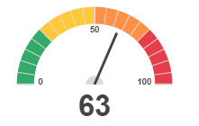
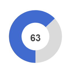
The above have all been modifying the default radial gauge. There are other a few other types of radial gauges available in VisualScript. Here are the default settings for a RadialRangeTop gauge. All we're setting is the value.
var myGauge=myShape.AddGauge("RadialRangeTop");
myGauge.SetProperties([{Name:VS.RadialGauge_Properties.Val,Value:63},]);
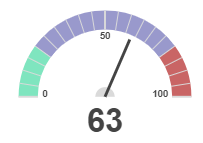
The default color settings for these gauges is probably ideal for most reports, but you do have the option to change them. You can select both what ranges show what colors and change those colors using RangeIndicators.
var myGauge=myShape.AddGauge("RadialRangeTop");
myGauge.SetProperties([
{Name:VS.RadialGauge_Properties.Val,Value:63},
{Name:VS.RadialGauge_Properties.RangeIndicators,Value:"0,20,#5FDFAF;20,80,#7F7FBF;80,100,#BC3F3F"}
]);
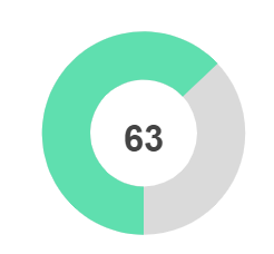
You can create a very minimalist gauge using "RadialSimpleTop". Choosing the type of gauge automatically sets some values that you don't have to worry about. We set the gauge to hollow, remove indicators and ticks, and set FilledRange to be true.
None of this is visible to you, just choose type and set a value .
var myGauge=myShape.AddGauge("RadialSimpleFull");
myGauge.SetProperties([{Name:VS.RadialGauge_Properties.Val,Value:63},]);
To modify the default settings, you can string together property modifications. Let's say you want to change the indicator from blue to green.
var myGauge=myShape.AddGauge("RadialSimpleFull");
myGauge.SetProperties([
{Name:VS.RadialGauge_Properties.Val,Value:63},
{Name:VS.RadialGauge_Properties.IndicatorColor,Value:"#5FDFAF"}
]);
When creating radial gauges, you'll first want to choose the type of gauge you want to make and then decide which of the default settings you want to override if any.
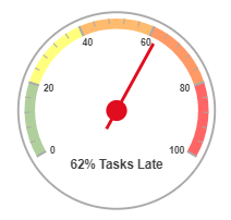
Below we chose the basic "RadialGauge" and added range indicators and a label.
var myGauge=myShape.AddGauge("RadialGauge");
myGauge.SetProperties([
{Name:VS.RadialGauge_Properties.Val,Value:62},
{Name:VS.RadialGauge_Properties.MajTickMax,Value:5},
{Name:VS.RadialGauge_Properties.MinTickMax,Value:5},
{Name:VS.RadialGauge_Properties.RangeIndicators,Value:"0,20,#9CC383;20,40,#FFFF5C;40,60,#FFAA4A;60,80,#FF7F3F;80,100,#FF3F3F"},
{Name:VS.RadialGauge_Properties.UnitFontSize,Value:12},
{Name:VS.RadialGauge_Properties.UnitLabel,Value:"% Tasks Late"},
]);
Linear Gauge Properties
- Min: sets the gauge range minimum data value
- Max: sets the gauge range maximum data value
- Val: sets the gauge current data value
- BarWidth: thickness of the core bar element
-
Orientation: layout orientation of the gauge
- horiz: horizontal layout
- vert: vertical layout
- MinTickMax: sets the maximum minor tick count
- majTickMax: sets the maximum major tick count
- MinTickLen: sets the minor tick length
- MajTickLen: sets the major tick length
- MinTickColor: sets the minor tick color (defaults to the shape's LineColor)
- MajTickColor: sets the major tick color (defaults to the shape's LineColor)
- UnitLabel: sets the units label that is appended to the units display
- NoUnits: flag to turn off units display
-
TickLabelFreq: if set, describes how ticks are drawn:
- all (or blank): draw all tick labels
- none: draw no tick labels
- startend: only draw first and last tick labels
- startendcenter: draw first and last tick labels, and if there is a center tick, draw center tick label.
- TickLocation: positioning of ticks relative to bar. Format is: '[inside|outside].[left|right|both]'. e.g. "inside.left"
- LabelLocation: positioning of tick labels relative to bar. Format is: 'left','right',both'. Note: labels are always drawn on the outside of the bar
- RangeIndicators: a list of colored indicator ranges. Each range is defined by start%,end%,color. Multiple ranges are separated by a semi-colon. e.g. "30,60,green;60,80,yellow;80,100,#ff0000"
-
IndicatorType: indicator style:
- line: drawn as simple line
- arrowIn: arrow indicator drawn inside of bar (drawn on the same side(s) as the tick location)
- arrowOut: arrow indicator drawn outside of bar (drawn on the same side(s) as the tick location)
- solid: drawn as a filled bar
- bar: drawn as a series of bars
-
RangeWidthScale: specifies modification of range indicator rendering
- none: draw normally (full width of bar)
- ascending: draw with an ascending width
- descending: draw with a descending width
- side: draw on side of bar (don't use full width)
- IndicatorColor: sets the color of the indicator (defaults to the shape's LineColor)
- LabelFontSize: font size of the tick label
- UnitFontSize: font size of the units label
-
UnitPosition: This can override the default position for the text showing the label. This can be:
- bottom: place the text under the gauge
- right: place the text to the right of the gauge
- top: place the text above the gauge
- left: place the text at the left of the gauge
Examples of Linear Gauges
The default values for a LinearDetailHorizontal type of gauge specified with "LinearGauge" will produce this default gauge:
var myGauge=myShape.AddGauge("LinearGauge");
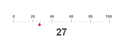
You can modify the value, ticks, add a label, and more using the SetProperties method.
For example, you can change the position of the label, change the indicator type, and change the indicator's position.
myGauge.SetProperties([
{Name:VS.LinearGauge_Properties.Val,Value:27},
{Name:VS.LinearGauge_Properties.MajTickMax,Value:5},
{Name:VS.LinearGauge_Properties.MinTickMax,Value:5},
{Name:VS.LinearGauge_Properties.IndicatorType,Value:"arrowOut"},
{Name:VS.LinearGauge_Properties.LabelLocation,Value:"left"}
]);
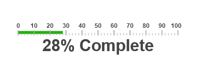
You can make the rande indicator a bar and change its color to green:
myGauge.SetProperties([
{Name:VS.LinearGauge_Properties.Val,Value:28},
{Name:VS.LinearGauge_Properties.MinTickMax,Value:5},
{Name:VS.LinearGauge_Properties.IndicatorType,Value:"solid"},
{Name:VS.LinearGauge_Properties.IndicatorColor,Value:"#1FB306"},
{Name:VS.LinearGauge_Properties.UnitLabel,Value:"% Complete"},
]);
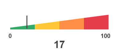
You can choose a different type of linear gauge that by default shows a color-coded range ramping from small to large. The default color scheme is ideal for most situations and all you have to do is supply a value.
var myGauge=myShape.AddGauge("LinearRangeRampHorizontal");
myGauge.SetProperties([{Name:VS.LinearGauge_Properties.Val,Value:17},]);
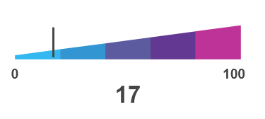
You can specify a different color scheme and range settings.
var myGauge=myShape.AddGauge("LinearRangeRampHorizontal");
myGauge.SetProperties([{Name:VS.LinearGauge_Properties.Val,Value:17},
{Name:VS.LinearGauge_Properties.RangeIndicators,Value:"0,20,#00A7EE;20,40,#017CC8;40,60,#343387;60,80,#3D0777;80,100,#AE007D"}
]);
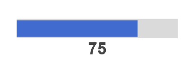
The simplest linear gauge types remove all ticks and labels. The default indicator bar color is blue.
var myGauge=myShape.AddGauge("LinearSimpleHorizontal");
myGauge.SetProperties([{Name:VS.LinearGauge_Properties.Val,Value:75},]);
You can change the color to anything you want.
var myGauge=myShape.AddGauge("LinearSimpleHorizontal");
myGauge.SetProperties([
{Name:VS.LinearGauge_Properties.Val,Value:75},
{Name:VS.LinearGauge_Properties.IndicatorColor,Value:"#B0D403"}
]);

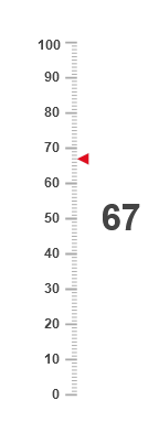
To change the orientation of a linear gauge, you can set its Orientation property, but you might run into shape size issues. It's easier to
choose a gauge type that is already set to vertical and comes with the correct default settings.
var myGauge=myShape.AddGauge("LinearGaugeVertical");
myGauge.SetProperties([{Name:VS.LinearGauge_Properties.Val,Value:67},]);
Example
myGauge=myGauge.SetShowDataTable(true);
Syntax
myGauge=myGauge.SetShowDataTable(state);
Usage
In SmartDraw, a gauge the user may set properties using a shape data table that maps the
properties to fields in the data table. If
SetShowDataTable() is set to true,
this table is automatically created.