Whether you're writing a business report, technical paper, or making a presentation, using diagrams or graphics can help clarify your message.
But which graphic is best for the information at hand?
Here is a list of some diagram types you may want to use in various situations to enhance your presentation or report.
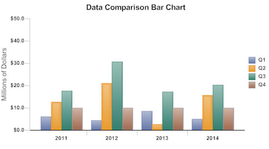
Use a bar graph to compare sets of data against one another, or show changes in data over time. Bar graphs can be vertical (as shown here), horizontal, or stacked. Problems can arise if proportions and spacing are inconsistent, although SmartDraw eliminates this problem by doing the formatting for you.
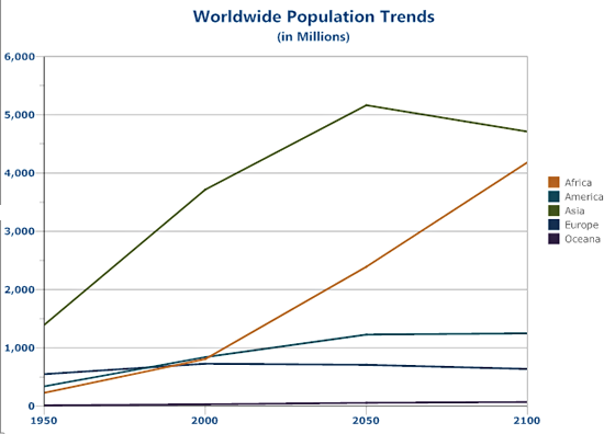
A line graph is useful for showing trends over time. It's best for illustrating dramatic changes. Make sure the scale is appropriate and don't clutter the chart with too much information.
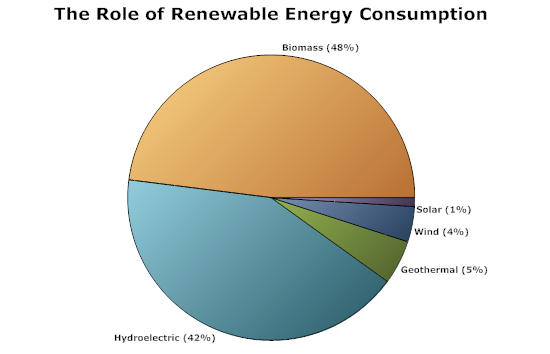
A pie chart displays the distribution of several items in one data category. The main thing to remember when using a pie chart is that the sum of the data must equal 100 percent. Pie charts work best when there are no more than five "slices," or data points, and the amounts vary enough to make the diagram visually compelling. In this example, the five data points range from 1 to 48 percent, so the differences are illustrated quite effectively.
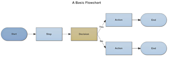
To show the sequence of steps in a process or the effects of decisions, use a flowchart. Flow the information from left to right or top down, and keep the diagram clean and simple. It should be easy for anyone to follow and understand with no explanation.
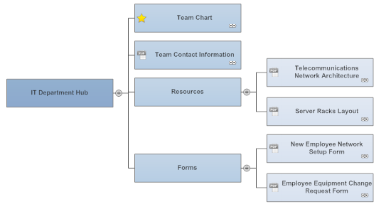
Instead of categorized lists of bullet-point information, a mind map provides a visual structure that makes the information easier to find and comprehend.
Mind maps created in SmartDraw are also a very useful tool for a presentation, because hyperlinks to web pages or documents can be inserted in any box, making the linked information easy to access with just a click.
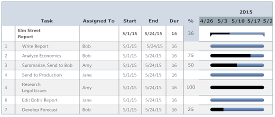
For projects, a Gantt chart is a good way to show a quick summary of tasks, assignments, timelines, and to report progress. For larger projects, a Gantt chart may have too much detail for a report or presentation. In that event, it may be preferable to just show a timeline.
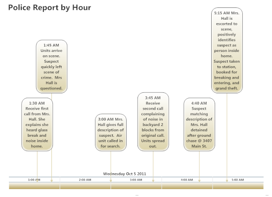
A timeline is a straightforward graphic that shows events as they occur, or or scheduled to occur. Major milestones or deadlines serve as markers on a scaled timeline, which typically runs horizontally along the bottom of the graphic.
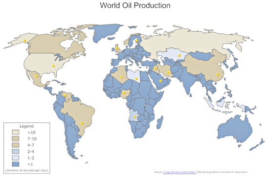
A map is an excellent way to show geographically based information. They might include sales territories, airline routes, or numerical data defined by geography, as shown in the map below. It's important to make sure colors are easy to differentiate and labels or legends are clear. Don't try and pack too much detail into a map, as it may confuse the reader or audience.