In the world of business, it's something of a running joke. PowerPoint® presentations can often feel like torture.
Why? The problem is PowerPoint® itself, because of the way it's designed.
Open up PowerPoint® to create a new document. You'll notice that the default is a bullet-point list, which is the worst possible format to use in a presentation. No one in any audience wants to read a laundry list of information. Or have it read to them.
Fortunately, there's a simple solution. Replace the bullet points with interesting and informing charts, graphs, and other attention-grabbing visuals.
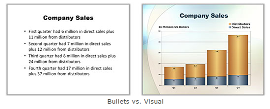
Here's an example of the same information from a boring bullet-point slide presented as a bar chart. There's just no comparison.
You're probably thinking, "Sure, the visual slides look better—but it takes so much longer to make visuals."
If so, you'll be pleasantly surprised to find out how quickly and easily you can make great-looking presentation graphics with SmartDraw. For most people, a chart like the one shown above can be completed in about the same amount time as it takes to type out that boring bullet-point list. And the benefit is obvious—at least it will be to your audience.
Plus, SmartDraw gives you effortless integration with PowerPoint®. It lets you seamlessly turn all of your SmartDraw charts, maps, and graphics into a presentation.
Only SmartDraw lets you create and share vivid, professional-looking presentations with such ease. It's the perfect cure for the PowerPoint® blues.