Clearly communicating your message is crucial in business. Often, words and numbers alone just don't do the trick.
To illustrate data in a report or presentation, few things convey information as quickly and effectively as a chart.
Excel offers several types of charts and graphs with some customization features. The problem is, unless you're a "power" Excel user, their charts can be difficult and frustrating to use.
Even if you are a wizard with Excel charts there is only so much you can do with them. Excel is an excellent spreadsheet program but its charting features can be frustrating.
SmartDraw, on the other hand, is designed for creating professional-quality charts in minutes. It does most of the work for you, automatically. Unlike Excel, which requires the average person to spend a lot of time hunting through tool bars, drop down menus, and so forth, SmartDraw offers options that are easy and intuitive. Most of your work can be done directly on the chart itself.
Let's look at a very simple Excel data table and use it to create a basic line chart using both Excel and SmartDraw.
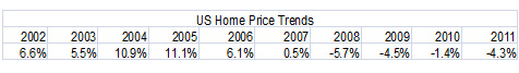
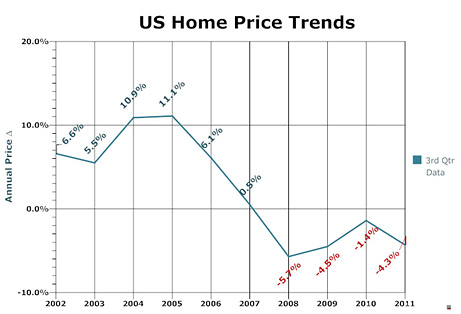
In Excel, we have to click the graphs tab from the spreadsheet, which opens a default graph on the screen. After several clicks, and probably a few searches on the "Help" tab, we have defined data from the table above. Our Excel chart looks like this:
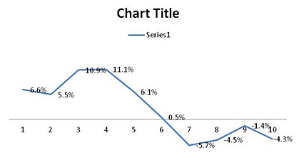
This chart is a mess and, frankly, the task of completing it can be daunting if you aren't experienced using the charting features in Excel. Clearly, there's going to be a lot of work needed to clean this up and make it presentable.
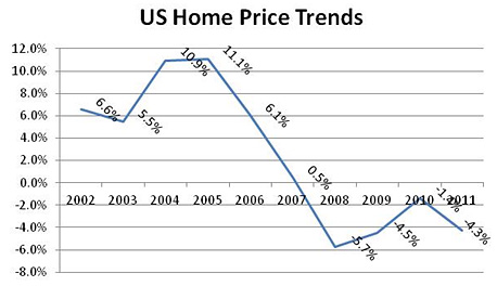
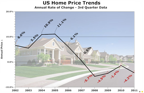
Okay, let's bring in the same Excel data table using SmartDraw. We import the data from the same Excel table and SmartDraw gives us this as a starting point:
This chart is almost presentation ready right now. In fact, you can click on the data labels, type in the title and information you want, and have a very basic chart that's ready to go in seconds.
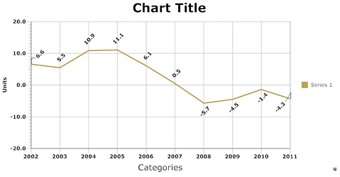
Now let's go back over to the clean-up job on our Excel chart. After several more points, clicks and a considerable amount of jumping between toolbars, we have a chart that looks like this.
One of the first things you'll notice about the above chart is that the X-axis labels lie below the "zero" line on the vertical axis. Because we have some negative numbers, those labels run right through the data on the chart. This is the default setting in Excel, and while it can be corrected, the fix isn't at all intuitive. (In fact, if you haven't done it before, you'll probably need to do a web search to find the answer, which is what we had to do—and, well... good luck with that!) If your data includes negative numbers, this can be a frustrating situation. Chances are you've probably seen a PowerPoint® presentation with a chart that looked like this ugly thing.
Let's go back to our SmartDraw chart. Unlike Excel, SmartDraw actually lets us point, click and edit virtually any of our changes right on the chart. With a few clicks, you can see that we've added a title, some labels and a splash of color to our SmartDraw chart below. This chart was actually created in less time than the Excel chart above. Which of these two charts would you rather use at your presentation or put in your report?
You could certainly stop at this point and have a very nice-looking chart to present. For a report or meeting, this is ideal. But for a presentation you might choose to go just a bit further and add a picture to the background. After all, why simply inform your audience when you can also entertain and impress them.
In just a couple of minutes, you can make your SmartDraw chart look like this. Compare this chart to the ones you're used to seeing. This is just one example, created easily with no training or special skills, using SmartDraw.
SmartDraw also works seamlessly with the entire suite of Office® products. Insert your SmartDraw charts into Word® documents or PowerPoint® presentations with a single click.