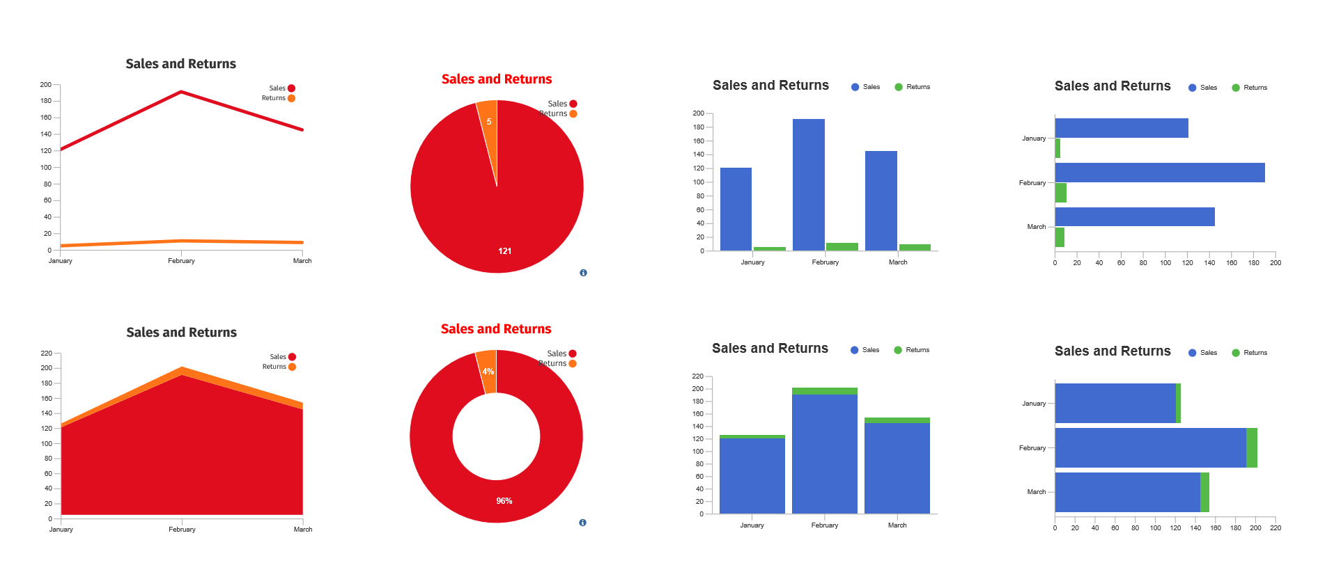
You can fill any shape with a graph by calling myShape.AddGraph(GraphType). A graph can show relationship between varying quantities.
Below is a simple way to add a line graph to your report.
{
                    var myDocument=new VS.Document();
                    var rootShape=myDocument.GetTheShape();
                    var myGraph=rootShape.AddGraph(VS.Graph_Types.LineChart);
                    }
You can also choose other values for the, for the GraphType:
VS.Graph_Types =
                    {
                    LineChart: "LineChart",
                    AreaChart: "AreaChart",
                    PieChart: "PieChart",
                    DonutChart: "Donut",
                    BarChart: "BarChart",
                    BarChartStacked: "BarChartStacked",
                    BarChartHorizontal: "BarChartHorizontal",
                    BarChartStackedHorizontal: "BarChartStackedHorizontal",
                    };
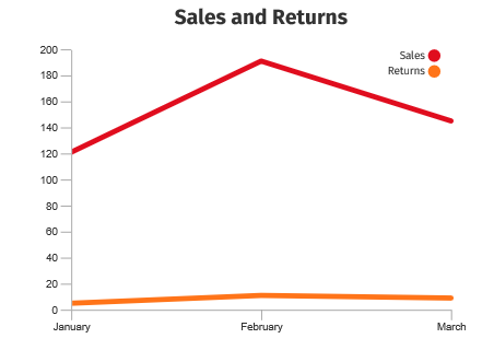
You set the data values for a graph by assigning a VS.DataTable() to it using the SetDataTable() method.
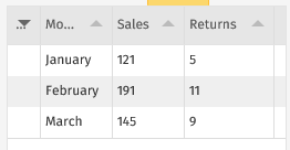
{
                    var myDocument=new VS.Document();
                    var TableID=1;
                    myDocument.AddDataTable(TableID,"Sales Data","Month,Sales,Returns\nJanuary,121,5\nFebruary,191,11\nMarch,145,9");
                    var rootShape=myDocument.GetTheShape();
                    var myGraph=rootShape.AddGraph(VS.Graph_Types.LineChart);
                    myGraph.SetDataTable(TableID);
                    }
The first row of the table defines the column names and hence the name of each data set. The first column defines the values for the X axis. The remaining columns are Y data sets.
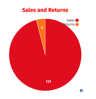
PieCharts take their values from one of the data rows. By default this is the row with ID=1, but you can override this by assigning the data row with myGraph.SetDataTableRow(ID).
Here is a pie chart using the first data row for slices:
The color of the axes are set by setting the
LineColor of the parent shape of the graph.
Their thickness is set by setting the LineThickness of the parent shape.
The color of the axis, legend and title label text is set by setting the
TextColor of the parent shape.
All other properties are set using the VS.Graph.SetProperties method.
This takes a valuearray as an argument.
{
                    var myDocument=new VS.Document();
                    var TableID=1;
                    myDocument.AddDataTable(TableID,"Sales Data","Month,Sales,Returns\nJanuary,121,5\nFebruary,191,11\nMarch,145,9");
                    var rootShape=myDocument.GetTheShape();
                    var myGraph=rootShape.AddGraph(VS.Graph_Types.LineChart);
                    myGraph.SetDataTable(TableID);
                    myGraph.SetProperties([{Name:VS.LineChart_Properties.LegendPos,Value:"inside"},
                    {Name:VS.LineChart_Properties.Title,Value:"Sales and Returns"},
                    {Name:VS.LineChart_Properties.TitlePos,Value:"top"}]);
                    }
The properties that can be set are defined in the SDK:
VS.LineChart_Properties =
                    {
                    GraphAreaWidth:"graphAreaWidth",  //width of the core graph area(minus axis, legend and title)
                    GraphAreaHeight:"graphAreaHeight",  //height of the core graph area(minus axis, legend and title)
                    LegendPos: "legendPos",     //data set legend positioning
                    LegendShape: "legendShape",   //legend color shape (round or square)
                    UnitLabel:"unitLabel",      //y axis units label that is displayed at the top of the y axis
                    TickLen:"tickLen",        //axis tick lengths
                    TickWidth:"tickWidth",      //line thickness of the ticks
                    GraphLineWidth:"graphLineWidth", //line thickness of the graph data lines
                    YTickCount:"yTickCount",    //# of ticks on the y axis
                    YMinZero:"yMinZero",      //if true, sets the min value of the yAxis to 0, otherwise, min value is computed from the data
                    YRuleLines:"yRuleLines",    //if true, displays ruling lines behind the graph, aligned with the y axis ticks
                    YAxisHide:"yAxisHide",      //if true, hides the main(vertical) part of the y axis(ticks and tick labels will still be shown unless yTickCount = 0)
                    XAxisStep:"xAxisStep",      //the step count for the x axis labels(and ticks).Defaults to 1, meaning no labels are skipped.Note: the step will be increased if there is not enough room for the x axis labels.
                    YFormatter:"yFormatter",    //D3-based format string for the yAxis labels(see https://github.com/d3/d3-format. Default is "s")
                    DataSetColors:"dataSetColors",  //comma - separated list of colors that define the data set colors
                    LabelFontSize:"labelFontSize",  //font size of the axis, unit and legend text
                    Title: "title",         //title text
                    TitlePos:"titlePos",      //title position
                    TitleColor:"titleColor",    //title text color(defaults to TextColor)
                    TitleFontSize: "titleFontSize", //title font size
                    };
Values for these are defined as follows:
- graphAreaWidth: width of the core graph area (minus axis, legend and title)
- graphAreaHeight: height of the core graph area (minus axis, legend and title)
-
legendPos: data set legend positioning
- "none": do not display
- "inside": display within graph area (vertical layout)
- "right": display to right of graph area (vertical layout)
- "top": display above graph area (horizontal layout)
- "topleft": display above graph area, using only left half of graph area
- "topright": display above graph area, using only right half of graph area
- "bottom": display below graph area (horizontal layout)
- "bottomleft": display below graph area, using only left half of graph area
- "bottomright": display below graph area, using only right half of graph area
-
legendShape: legend color shape
- "round": draw the legend color as circle
- "square" draw the legend color as square
- unitLabel: y axis units label that is displayed at the top of the y axis
- tickLen: axis tick lengths
- tickWidth: line thickness of the ticks
- graphLineWidth: line thickness of the graph data lines (linechart only
- yTickCount: # of ticks on the y axis
- yMinZero: if true, sets the min value of the yAxis to 0, otherwise, min value is computed from the data
- yRuleLines: if true, displays ruling lines behind the graph, aligned with the y axis ticks
- yAxisHide: if true, hides the main (vertical) part of the y axis (ticks and tick labels will still be shown unless yTickCount = 0)
- xAxisStep: the step count for the x axis labels (and ticks). Defaults to 1, meaning no labels are skipped. Note: the step will be increased if there is not enough room for the x axis labels.
-
yFormatter: D3-based format string for the yAxis labels (see
https://github.com/d3/d3-format Default is "s")
- dataSetColors: comma-separated list of colors that define the data set colors
- labelFontSize: font size of the axis, unit and legend text
- title: title text
-
titlePos: title position
- "none": no title
- "top": display above graph area
- "topleft": display above graph area, on left
- "topright": display above graph area, on right
- "bottom": display below graph area
- "bottomleft": display below graph area, on left
- "bottomright": display below graph area, on right
- titleColor: title text color (set via SetTextColor)
- titleFontSize: title font size
- dataVals: array of data values to graph. Each value in the array is an array of values for each data set at a given x position in the graph.
- dataSetLabels: array of data set labels. Must match the count of data sets defined in dataVals.
- xAxisLabels: array of x axis labels, corresponding to each entry in the dataVals array. Must match the count of data records in the dataVals list.
Settings:
unitLabel: "Hops"
title: "Hop Test"
titlePos: "top"
legendPos: "inside"
Settings:
unitLabel: "Hops"
title: "Hop Test"
titlePos: "top"
legendPos: "right"
Settings:
unitLabel: "Hops"
title: "Hop Test"
titlePos: "top"
legendPos: "bottom"
Settings:
LegendPos: "inside"
yRuleLines: true
Settings:
title: "Jump Test"
titlePos: "topleft"
legendPos: "topright"
Settings:
title: "Jump Test"
titlePos: "topleft"
legendPos: "topright"
barGroupType: "stack"
Settings:
title: "Jump Test"
titlePos: "topleft"
legendPos: "topright"
barOrient: "horiz"
Settings:
title: "Jump Test"
titlePos: "topleft"
legendPos: "topright"
yRuleLines: true
- chartRadius: radius of the core pie graph area (minus labels, legend and title)
- innerRadius: inner radius of the pie chart (a non-zero value creates a donut-type pie chart)
-
legendPos: data set legend positioning
- "none": do not display
- "right": display to right of graph area (vertical layout)
- "top": display above graph area (horizontal layout)
- "topleft": display above graph area, using only left half of graph area
- "topright": display above graph area, using only right half of graph area
- "bottom": display below graph area (horizontal layout)
- "bottomleft": display below graph area, using only left half of graph area
- "bottomright": display below graph area, using only right half of graph area
-
legendShape: legend color shape
- "round": draw the legend color as circle
- "square" draw the legend color as square
- displayDivider: Boolean. If true, display a divider between pie wedges.
- dataSetColors: comma-separated list of colors that define the data set colors
- labelFontSize: font size of the axis, unit and legend text
- labelColor: color of data labels when displayed outside of chart area as callouts (defaults to textColor)
- altLabelColor: color of data labels when displayed inside of chart area (defaults to labelColor)
-
labelPos: location of data labels
- "none": do not display data labels
- "inside": display data labels inside
- "outside": display data labels outside with callouts
- "mixed": display data labels inside if they fit, otherwise display outside with callouts
-
labelFormat: defines how the data labels are displayed
- "value": display data as values (default)
- "percent": display data as a percentage of the whole data set
- showDataLabels: Boolean. If true, prepend data title to the data.
- labelLineLength: length of data callout lines when displayed as outside.
- title: title text
-
titlePos: title position
- "none": no title
- "top": display above graph area
- "topleft": display above graph area, on left
- "topright": display above graph area, on right
- "bottom": display below graph area
- "bottomleft": display below graph area, on left
- "bottomright": display below graph area, on right
- titleColor: title text color (defaults to textColor)
- titleFontSize: title font size
Settings:
title: "Pie Chart"
titlePos: "top"
legendPos: "right"
labelPos: "inside"
Settings:
title: "Pie Chart"
titlePos: "top"
legendPos: "right"
labelPos: "outside"
labelFormat: "percent"
Settings:
title: "Pie Chart"
titlePos: "top"
legendPos: "right"
labelPos: "mixed"
labelFormat: "percent"
showDataLabels: true
Settings:
title: "Pie Chart"
titlePos: "top"
legendPos: "right"
labelPos: "inside"
GraphType: "Donut"